Build a Bootstrap WordPress Responsive Menu in 10 Minutes
This article has been updated to work with the latest Bootstrap 4. The code for Bootstrap 3 menus I’ve archived in a gist if you need it.
 I love Bootstrap. It’s powerful, sleek and functional. It’s also responsive and that means using Bootstrap with WordPress Themes works perfect.
One of the things that is often lacking in themes built with Bootstrap is the ability to create the proper menu with support for all the features – like dropdowns, icons, dividers & headers.
The default menu functions that come in WordPress core are hard to make a proper Bootstrap navbar with. The BS navbar requires a specific placement of classes on different elements and it’s not easy to place them without extending the base Walker_Nav_Menu class to override some functions and add some extra ones to handle the new placement.
If you need a quick way use Bootstrap with WordPress in a theme you could always include Bootstrap from a CDN.
Using a Responsive Bootstrap Menu with WordPress
Bootstrap WordPress Responsive Menu Downloads
If you’re following along with the code in the post then you’ll need to grab the Navwalker from github.
Estimated time to complete = 10 minutes.
Or you could give my Bootstrap 4 Theme a try. The walker is inlcuded there already if you wanted an example. The dev version is available on github and you can download the theme directly from the wordpress.org theme directory
Add a WordPress Menu
The first thing you need to do is to ensure you have a WordPress menu location defined in the theme to place the menu at. If you are using one of your theme’s existing menus, or have already added a location, then skip to the next section.
Find your theme’s setup function (usually inside the functions.php file) and add the register_nav_menus(); function for a new menu. If you can’t find a setup function in your theme that’s ok, just create one that’s the same as the following.
You could also add this to a custom functionality plugin if you would rather but it’s probably best to keep theme components inside the theme files.
 // this is the setup function.
function pwwp_mytheme_setup() {

    // the register_nav_menus call is what you should copy into your own
    // themes setup function.
    register_nav_menus(
        array(
            'footer_nav' => __( 'Footer Menu', 'mytheme' ), // example of adding a menu location
            'top_menu' => __( 'Top Menu', 'mytheme' ), // we will be using this top_menu location
        )
    );

}
// this will hook the setup function in after other setup actions.
add_action( 'after_setup_theme', 'pwwp_mytheme_setup' );
This code registers 2 theme menu locations – the footer_nav and the top_menu. We will only be using one of these – top_menu– to create our Bootstrap WordPress responsive menu but you could add as many custom menus here as you want.
Using Bootstrap with WordPress wp_nav_menu() Function
The WordPress menu markup that’s generated by the default walker doesn’t work well to create Bootstrap Navbars. Bootstrap provides and dropdowns, headers and dividers that need wrappers and class placement that isn’t possible without a lot of filtering of the items.
The functions and walker that WordPress uses to build it’s menus and create a custom navwalker, just extend the built-in Walker_Nav_Menu class.
WordPress Menu Navwalker Classes
A navwalker is a set of functions and logic that is used to walk it’s way through a navigation of some kind based on a given input. With the default walker used for navs the way it walks through things isn’t quite right to create a Bootstrap Nav. To make it happen a custom navwalker class is used that extends, and overrides, how the menu input gets handled and how the output is created. Within a custom navwalker you have complete control over how the menu behaves and you can ensure the specific placement of classes is done on the correct elements.
With a custom walker you can build a true responsive Bootstrap Nav in WordPress themes and add items to it using the built-in WordPress menu editor.
Bootstrap Responsive WordPress Menu Walker Class
The custom walker that we’re going to use can be found on Github. The original version was written by Ed McIntyre – Twittem. Since then myself and other developers have worked to keep it updated and provide support and maintenance for users.
The walker class is the most complicated code involved in this tutorial. Since it’s already written and can be used as-is I won’t go into detail about that code. Just download it and include it in your theme. The latest stable version is for Bootstrap 3 but a Bootstrap 4 branch is available. The latest version is for Bootstrap 4 – with versions available in separate branches for Bootstrap 3 and Bootstrap 2.
Download WP Bootstrap Navwalker
Including it in your theme is easy, just copy the class-wp-bootstrap-navwalker.php file into your theme folder then add the following line to your functions.php file.
// Register Custom Navigation Walker
require_once 'class-wp-bootstrap-navwalker.php';
If you place the file inside a folder – for example inside an /themename/inc/ folder then use inc/class-wp-bootstrap-navwalker.php as the file location.
Adding the Bootstrap Responsive Menu to your WordPress Theme
Now that we can run the menu through the Bootstrap navwalker all we have to do is add it to the pages.Adding it to the page is just a case of calling the wp_nav_menu() function with a handful of parameters, the walker class will handle all of the output for the actual navigation.
<?php
wp_nav_menu( array(
    'theme_location' => 'top_menu',
    'depth'          => 2,
    'container'      => false,
    'menu_class'     => 'navbar-nav mr-auto',
    'fallback_cb'    => 'WP_Bootstrap_Navwalker::fallback',
    // Process nav menu using our custom nav walker.
    'walker'         => new WP_Bootstrap_Navwalker(),
) );
?>
I want my menu to go in a navbar at the top of the pages but using similar code to create all kinds of bootstrap menus wherever you want. You can replace the navbar-nav with nav-pills or nav-tabs to make the kind of menu you want.
I’ll be placing the code to create my menu in the header.php file so I can make it a top menu. If you want to have it in a different place then just paste this code in wherever you want it to appear.
To make a responsive navabar you need to wrap the above code in some more mark-up. The block of code below is the responsive navbar code from the Bootstrap Docs with the Bootstrap Navwalker code included in the right place. It’s ready to paste right into your theme – but remember to change the menu parameter to the name you gave your menu when you registered it.
<div id="main_navbar" class="navbar navbar-expand-md navbar-light bg-light">
    <!-- you can remove this container wrapper if you want things full width -->
    <div class="container">
        <a class="navbar-brand" href="#"><?php esc_html_e( bloginfo( 'name' ), 'themeslug' ); ?></a>

        <button class="navbar-toggler" type="button" data-toggle="collapse" data-target="#headerNav" aria-controls="headerNav" aria-expanded="false" aria-label="<?php esc_attr_e( 'Toggle navigation', 'best-reloaded' ); ?>">
            <span class="navbar-toggler-icon"></span><span class="sr-only"><?php esc_html_e( 'Toggle Navigation', 'themeslug' ); ?></span>
        </button>
        <nav class="collapse navbar-collapse" id="headerNav" role="navigation" aria-label="Main Menu">
            <span class="sr-only"><?php esc_html_e( 'Main Menu', 'themeslug' ); ?></span>
            <?php
            wp_nav_menu( array(
                'theme_location' => 'bnav_topbar',
                'depth' => 2,
                'container' => false,
                'menu_class' => 'navbar-nav mr-auto',
                'fallback_cb' => 'WP_Bootstrap_Navwalker::fallback',
                'walker' => new WP_Bootstrap_Navwalker(),
            ) );
        ?>
        </nav>
    </div>
</div>
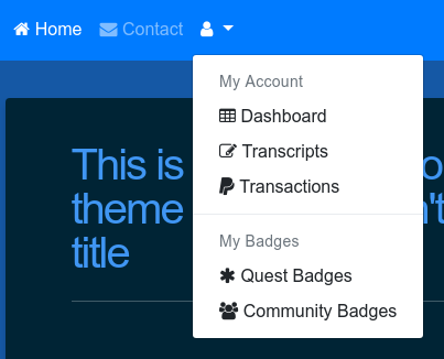
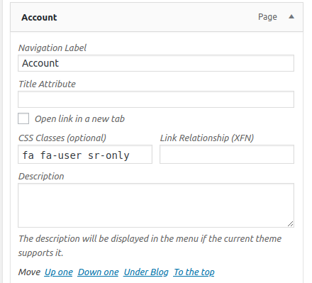
Headers, Dividers and Menu Icons with Font-Awesome or Glyphicons
The navwalker class lets you use the extras that Bootstrap provides like icons, headers and dividers. These can be set in the menu editor by adding the appropriate class names to the CSS Classes for the item you want them applied to.
Supported link mods and class types are: .disabled, .dropdown-header, .dropdown-divider, .sr-only (can be used to create icon only menu items).
Bootstrap Icons with WordPress Menu Items
The navwalker looks for glypicons and font-awesome icons. Add the appropriate classnames for the icon you want. Examples:
fa fa-homeglyphicon glyphicon-homefa fab fa-user sr-only
Using Headers and Dividers In The Bootstrap WordPress Responsive Menu
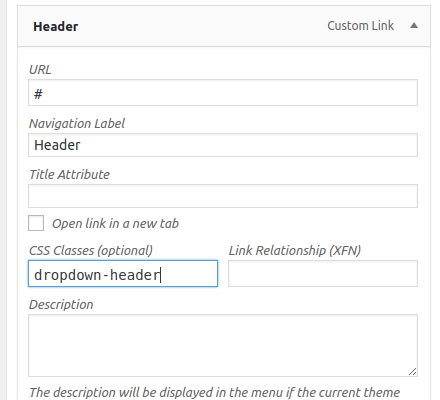
The navwalker looks for any header or divider classes added to the item and makes the appropriate markup changes. Examples:
dropdown-dividerdisableddropdown-header
Got Questions? Ask Them Now
Do you have any questions about using Bootstrap with WordPress, what this navwalker does or something else entirely? You can use the comments form to ask your question or you could click the button below to get a form to send me an email.
Final Product
The final product, once you’ve added some items and set the icons, looks something like this.


Pingback: Build a Responsive Nav Menu for WordPress - PattonWebz
Pingback: Floating Social Media Buttons - JQuery Floating Div - PattonWebz
Superb tutorial Will. Implementation in less than ten minutes!
Thanks for the kind words, Kate. As for you implementing in less than 10 minutes: That is awesome! I’m so glad I could help you out.
I’ll be sharing more Bootstrap specific tutorials in the coming weeks if you are interested in reading those and I shared this one the other day about using Bootstrap to make the jetpack social share buttons float: http://www.pattonwebz.com/wordpress-custom/floating-jetpack-social-share-buttons-in-responsive-design/ I would really appretiate your oppinion on how easy that one is to follow too 🙂
Hey William,
Great tutorial. I’m glad you found the navwalker useful. If you have any feature requests or suggestions feel free to send them my way!
Hey Ed, awesome to have you drop by 🙂
I actually do have a suggestion – I have been unable to create vertical dividers in the menu. Maybe it’s just an oversight on my part and I’ve just used the wrong syntax but if not then I would definitely suggest you add that. It was one of the first things I tried to do.
In addition to that I also make use of buttons within my navmenus on some sites by using the
.btnclasses from bootstrap and the.pull-right. Just a suggestion there but it would be very useful for the navwalker to include this.Thanks for reading the tutorial and thank you very much for open sourcing your navwalker 😀 😀 😀
For vertical dividers I assume you mean between menu items? There is no elegant way to do this inside the menu editor and since its not supported by the default Bootstrap css it may add confusion if it is included in the class. It can be quickly added with a few lines of css though. Here is a quick example i whipped up. http://codepen.io/twittem/pen/JLrtv
As for a portion of the menu pulled-right I do this in almost every project. The best thing you can do is to define a second menu area and a second menu for that section. Below is an example of a site where I created a menu with a pulled right section that changes whether your logged in or not.
The buttons pulled right are statically defined as they will not change, but once logged in I am using a second menu instance to define the account drop down on a button. By changing the ‘menu_class’ of the menu definition you can create some pretty awesome things.
https://gist.github.com/twittem/6022669
At the moment you cannot define button groups with the walker as the use a different syntax. Possibly I will create another walker for button groups, but I will probably wait for Bootstrap 3 first.
The dividers I was referring to are the vertical dividers bootstrap comes with for use within navbars. EX: between “Link” and “Dropdown” on the right side of the ‘Responsive Navbar’ seen in the Bootstrap docs, but I understand your walker was created primarily for navs outwith the responsive navbar – although I’ve used it pretty nicely within them too 😉
As for the tips regarding right pulled sections: awesome advice to use a second defined menu paired with a static logged out area. That’s exactly what I’m gonna do from now on.
Another walker for buttons actually sounds like a better idea than including it within the main walker you created. Once Bootstrap 3 hits I’ll be hot on your heels waiting on you releasing something for it lol
The problem when simply adding the class of ‘divider’ is that WP removes links without anchor text (if you view the source on the docs you will see what I mean by “links without anchor”) so if it was parsed by the navwalker to simply not paste anything within the
liit would be able to add the dividers.You have a good eye, I didn’t even notice the vertical divider there. The walker was built to be flexible and support all bootstrap nav types, even Tabs and Nav Lists.
I just did a commit with an update to add support for vertical dividers. If you start using version 1.4.3 , simply add a Link menu item with a URL of
#and a Link Text ofdivider-verticalas you would to add a horizontal divider.On 3.0, I have already created a new branch of the repository to start work on the walker for 3.0 and it should be pretty simple to port over a button once it is done.
Looks like I must have deleted the second last paragraph in my reply to you accidentally… lol but at least you were still able to make sense of it.
I’ll swap in the new navwalker version you just make and update this post referencing the new ability.
I’ve also been thinking about writing a supplemental post about the different kinds of navmenus that you are able to create with the walker, because I only touched on that ability on this post.
As a quick aside: I’m curious how you found out about this post. I know I’ve been sending through a steady stream of traffic to the github repo so was it through the analytics you found that I had linked to you? As I said, just curious how you found the site and if it was through your analytics or another method.
I actually did find your post through analytics. On GitHub Pages you can actually specify your own Google analytics tracking code. Since you linked to the GitHub Page and not the repo directly I can see the traffic.
As of June 17th you have passed over 55 referrals.
That’s pretty cool that you can link GA tracking directly like that, I’m gonna bear that in mind with future links and see if I can lure more guys like you over here haha!
I didn’t realize it was as many as 55 referrals but I did notice a fair amount of click-through. Here’s hoping that a good number of those people have used and are now promoting the use of your navwalker because it’s definitely one of the handiest pieces of code I’ve found. It’s worth it purely for the easy way you’ve enabled the glyphicons but the fact that you can also use it for all the nav types makes it a must-have in any Bootstrap powered WP theme.
Thank you very much, very usefull !
Hello author,
I am in trouble. I am trying to use this but drop-down is not working in my site. Here is my site: shihabmridha.com/themab/
Zoom in my site. Then nav menu will appear. But dropdown isn’t working.
Please help.
Thank
Hey Shihab,
I took a look at the site you linked and turns out I dropped by just as you were working on it because I saw the menu change between refreshes haha
But I see you’re doing this with 2 menus in the code (I can see why you would do it that way) but personally I would stick to doing it with a single menu if you can.
Because you’re doing this with 2 menus I’m assuming the code you’re using to make it is a bit more complicated than a single menu version so I don’t want to jump in with a solution until I know the full problem so if you could give me a bit more info that would be helpful. Why the need for 2 menus? What version of Bootstrap are you using? What version of the Bootstrap Navwalker?
I’ll do my best to help you out with this 😀
Took another quick look at this after I replied to your comment and in the JS console I notice a bunch of errors mostly relating to your jquery.js file. Is that the standard jQuery library you’re including? WP bundles a version of jQuery with it that you should use (or load it from Google CDN). It would get used by default if you tried to enqueue the script through functions.php.
But anyway let me know how I could help you out.
This has been updated to work with Bootstrap 3, should correct the dropdown issue you had.
Hi, I have an odd question. For some reason my site is using a different menu than I set for top menu. I’ve looked all over, but I have the right menu selected in my WP settings, but the wrong one shows up. Any idea?
Ahh yes actually I do. I’ve just rewritten this post tonight and I made a typo. In the
wp_nav_menu()function I’ve told you to use menu to call it when I should have said to use theme_location.The new codeblock should look like this:
Sorry about that, but thanks so much for catching it so quickly after I updated it 😀
LOL 🙂 I’m good at that. Thanks so much for the quick reply. Worked like a charm. Also, does this support drop downs? I have a sub item and it’s not dropping down to show it.
It does support dropdowns (and glypicons too) but the dropdowns depend on the dropdown.js file from Bootstrap. It comes pre-complied in the
bootstrap.jsfile but if you don’t want the whole js file then use the one I linked in this comment.You’ll need to enqueue the javascript file you need (either just
dropdown.jsor the wholebootstrap.js) in your theme using to get the dropdowns working. You can read about the dependencies for each of the Bootstrap components in the docs.Also I noticed you’ve only recently started experimenting with Bootstrap (yeah… I stalked the twitter feed from your main site lol) so if you need any help whatsoever give me a shout and I’ll be more than happy to help you out 😀
And just an FYI for when you get the dropdowns working: they don’t appear on hover, they appear on click.
This is to make them touch friendly because it’s a nightmare to hover over items on a touch screen :p
Awesome, I love stalkers. lol 🙂 Bootstrap is pretty cool. I’m now trying to learn how to use it with WordPress, another love of mine. Thanks for the offer to help, I may take you up on that!
I found the problem, silly me. I was playing around with my footer.php and accidentally removed the js file links. doh! Thanks for the tip. It could have taken me forever to realize that.
Personally I don’t like the fact you have to click the parent to get the dropdowns, but I understand their reasoning. Just something to get used to I guess.
I’m also a massive fan of Bootstrap and WordPress, so I think we’ll get along 🙂
…and wouldn’t it just be so handy if I could give you an elegant, pure CSS, solution to make the menu appear on hover?
😉
Perhaps we will. 🙂 Awesome solution. Thanks!
Hey, it should be “glyphicon-home” not “icon-home” or the icon will not show.
Hey Christian,
Good call, can’t believe I hadn’t noticed that. This post was actually written away back before Bootstrap 3 was released. Back then the Glyphicons that came with it were the halfling sprites and the classes were prefixed with
.icon-*classes but it now come with the font variant and the.glyphicon-*prefix to use it.I’ll update the post with the new markup 🙂
Hi William,
I setup your bootstrap navigation responsive menu a while back (I’m currently using Bootstrap 2). I like everything it’s done for me so far – which is fantastic! However I encountered one small problem and I posted this on Stackoverflow.
http://stackoverflow.com/questions/20391499/wordpress-bootstrap-responsive-nav-menu-how-to-toggle-top-menus-href-link-usi
While the navigation menus and styling comes out fine, I realised there’s a bug in the loop code that if a top menu has any children menus, the code resets its main link to “#”. But I don’t want that as I have set up pages which they have content in them thus I want the visitors to be able to navigate on the top menus links as well.
What do I need to do work around your menu walker plugin? I really use your big help here! And I don’t want to move to Bootstrap 3 just to fix this…
Hi Andy,
Let me start off by saying it’s nice to meet you and thanks for stopping by! The navwalker isn’t originally my code (credits go to @Twittem on github for that) but I’m pretty familiar and should be able to help you out with this.
I saw your query on stackoverflow the other day and left you a quick reply. I have planned to figure out a solution for you but I’ve just not managed to find the time to do it yet 🙁
If you could send me a quick email to will@pattonwebz.com so I can add this task to my calender that would be great. This way will help to keep it fresh in my memory because I’ll see it every time I check my calender 🙂
I didn’t actually remember you were using Bootstrap 2 for this so it’s just as well as you mentioned it again – because I would have been building and testing within Bootstrap 3 otherwise.
If you could send me that quick email I’ll link it to a task in my calender and work on it as soon as I can for you.
Hi William,
Many thanks for your post.
I just emailed it to you.
Hope to hear back from you soon! 🙂
Hi William,
This seems like it should be very easy to modify, but for some reason I cannot seem to be able to find where to change the settings of the width/resolution the responsive menu gets displayed.
I’d like to be able to modify that number, but can’t find it via the CSS or JS files.
Any help would be greatly appreciated.
Thank you very much.
Hey Lucille,
That’s commonly called the ‘mobile breakpoint’ and changing it actually involves making MANY, MANY changes to the CSS.
However, because of the way the LESS files are set-up with variables you can actually modify all the css to do this by changing a single value. If you go to the Bootstrap customizer and scroll down to the section with the variable
@grid-float-breakpoint. Default value for it is@screen-sm-minyou can change to to some other variable size like@screen-md-minor even a pixel value by using a number like679px.If you have any more problems just give me a shout and I’d be happy to take a closer look 🙂
Hello,
Thank you for this great solution. I was wondering if and how to use a 3rd level menu item with this. Is this possible? Currently using Bootstrap 2.3.2
Thank you in advance
Eric
Hey Eric,
Sorry it took me so long to reply, I’ve been a bit unwell recently.
Unfortunately with the Bootstrap Navwalker it’s not possible to access a 3rd level menu. The problem is that the parent item needs to have some markup added to it that let’s the CSS know that’s it’s a parent and the others are children – but WordPress doesn’t give us a way to easily add classes to the parent items that are within other menus.
I’m fairly certain that if you submitted an issue on Github in the Navwalker’s repo then Ed, the programmer of the navwalker, would be happy to help fix it – or he could explain better why it’s not possible.
Sorry I can’t be of more help to you with this but if you have any other Bootstrap or WP issues or questions then I’d love to try help you out with those.
Hey again,
Correction to what I just said to you. I actually just remembered a site that I managed to get a 3rd menu displayed in. It was using Bootstrap 2.3.2 as well so if you could reply to one of these comments and let me know that it’s ok to email you then I should be able to help you out if your still having problems with this 🙂
Sure thing, you can email me anytime. I just used the one level as mentioned. It was a real big deal for the site I was working on. More less just trying to figure it out.
Thanks so much for this tutorial – its been supremely useful. Just one thing though – I can’t seem to extend it to a $depth of 3? The grand-children elements are output in the html,. but I can’t seem to display them at all? Any help?
Hi Amanda,
Glad you found the tutorial useful and I can certainly help you out with getting the 3rd level displaying.
It’s weird that you commented today of all days – because 1 week ago I told another commentor that I would help then sort this same issue and I told them that I’d get back to them by the end of the day today with a workable solution. So by the end of the day I’ll have a solution for you too 🙂
The other commentor is using the older Bootstrap 2 with their project, are you using the latest version?
And FYI we’re currently planning to build support for these 3rd level menus directly into the bs-navwalker code – it’s a pitty that isn’t ready yet but WordPress makes it difficult to add our required class names to the menu.
Regards,
Will
I’ve been searching for a while and this one actually works! Thanks for providing.
Glad to have been able to help you, Aaron 🙂
Hot Damn. I fought with implementing a bootstrap nav into an underscores theme for two nights using a number of different tuts. Then I found this one, 10 minutes, on the pages and working perfectly. Thanks William.
Sorry I missed the notification for this message when it came through 🙁
Glad you managed to get it working with my tutorial though 😀
If your ever changing up your menu and can’t get it to work right give me a shout because sometimes the navwalker class doesn’t quite behave how you expect it to. Plus I’ve got a few code snippets here that make it work slightly differently based on some of the things others have asked for here in the comments.
Hey William,
Missed the notification as well. Thanks again, things seem to be working fine for me. Had a little issue figuring out using Font Awesome icons until I realized I needed both classes — fa fa-twitter — in the Title Attribute field. Thanks again.
Anytime Josh. If you have any more problems give me a shout 🙂
Hi, great tutorial and work well.
But, I got a question. I am using Bootstrap v3.1.1 and after I apply you tutorial, my dropdown menu appear on hover instead of click. Any solution for that?
Hey Nicky,
The menus should appear on click and usually a CSS edit is required to make them appear on hover so I’m not sure why yours are doing it without making those edits.
I haven’t tried this with the latest version of bootstrap yet so maybe they made some changes that make it do that (although that’s counter intuitive to the mobile first principal they work towards).
If you want to give me a link to the site I would be happy to check it out for you and see if I can figure it out. Of you don’t want to post the link publicly fell free to use the contact form to email it to me 🙂
Hi,
Glad to hear from you. But I am working on my local PC.
Hmm OK then what I’ll do is drop bootstrap 3.1.1 into one of my theme templates and run a menu through the navwalker like I done in this tutorial and see what happens.
It’s a JavaScript action that handles the click to open so I wonder if they changed how it works (the navwalker would need to be update to correct it if that’s the case).
Luckily I have a bunch of free time today so I can look into this for you and see if I can help fix it.
Is it OK to email you at the address you included when you commented if I make some progress?
Sure, of cause.
Thanks, man.
Hi William …just want to thank you a ton to saving me hassle of creating this wordpress menu with bootstrap. Keep doing such good work. God Bless!
You’re welcome 🙂
Hi William,
Very much enjoyed learning this tutorial “Build a Bootstrap WordPress Responsive Menu in 10 Minutes”. You got skills!
Everything worked as expected except I thought I might also see code to do the styling seen in your screen capture jpg here . Is there code you can post just to do the styling for your drop down? I wondering if I can post the custom css for your styled drop down into my currently empty wordpress style.css? I’m using bootstrap 3 with wordpress.
Cheers,
Eddie
Hey Eddie,
Glad you found the tutorial useful. Sadly the screenshot at the end of the tutorial is outdated. It was captured when /i wrote the tutorial (which was back when Bootstrap was still in v2. The screenshot shows the styles from that and not BS3.
If you want to make your menu look like the old one then you could crate the styles and put then in the themes style.css file like you suggested. I don’t know all the styles you would need but you could port the old styles from v2 into a v3 powered theme. If you want a hand doing that let me know and I’ll happily help. 🙂
Hey Will, it’s me again! Can’t say again how awesome this tutorial is! Obviously I’m using it again… a few more times and I might have it down. 🙂 I was wondering if there is an “easy” way to float links to the right of the navbar like it shows on Bootstrap’s site. http://getbootstrap.com/components/#navbar-default
I tried inserting “navbar-right” in the CSS class field in the WP menu, but it didn’t work.
Hey again Jessea,
I think I know what your talking about and there isn’t actually a way to make that happen with the navwalker as is. I have done it before tho and turned the right links into buttons.
This is what I think you mean: http://www.pattonwebz.com/wp-content/uploads/2014/06/2-section-menu.png
That site has ordinary links in the menu and then a pair of buttons in a navbar-right section – but you could put anything in the right section. I ended up needing to make 2 calls to wp_nav_menu() and create 2 separate menus to make it work.
The first menu is ran through the bs_navwalker as normal and then the second I think I ran through the ordinary WP walker and gave it a
container_class => 'navbar-right'arg.It’s possible I actually set the container up myself outside of the menu and told the walker that I didn’t want it to echo a container by passing this arg to the walker:
container => 'none', or I may have actually used the bs_navwalker. Can’t quite remember exactly so you may have to play around till you get it in the right place but hopefully I’ve pointed you in the right direction at least lolLet me know if your able to get it working and if not I’ll dig the theme I made for that site out of my archives and check exactly I done if for you.
And it’s great to hear from you again, Jessea!
I don’t always comment, but when I do, it cause something helped me a lot and saved me a day of very struggle 😀
Hey man, I only comment when something really helped me too.
Glad you found this useful 😀
Does not work on a tablet
I assure you that the Bootstrap navigation works perfectly well on mobile/tablet devices – and by extension the wp-bootstrap-navwalker.php does too. This is how the nav on a site I built with this very system looks on my tablet: https://docs.google.com/file/d/0B03uAc-5dfJwRFNRclRLMFNEYk0/edit?usp=drivesdk
I took that screenshot just a moment ago, directly with my tablet.
If you give me more info about what you tried, how it didn’t work and a link to a demo (if possible) I’ll probably be able to help you fix it quite quickly.
First thing I have to ask is have you definitely included the Bootstrap files in the page? Both the CSS and the JS from Boostrap are needed for mobile nav to function. Next thing to check is have you got the correct
viewportmeta-tag in your header?I’m always around to help people out with this so just leave another comment here or drop me an email using my contact form and I’ll get back to you ASAP with some help 🙂
I concur with William, I have been using Bootstrap for a long time and never had any issue with it not working.
Hi William
Thanks for the great tutorial. I’m using it on a site in development at the moment. Only, the mobile toggle menu doesn’t seem to be working (nothing happens when I click the button). Wondered if you had any ideas? Site is: http://lauratisdall.com.gridhosted.co.uk
Using latest Bootstrap, Underscores theme and latest wp-bootstrap-navwalker.
Cheers! 🙂
Hey Mike,
Glad you found the tutorial useful. From looking at your test site I can’t see exactly what’s stopping it from working. Everything that I can see in the code looks correct to me.
That being said your now the 2nd person this month to comment that this isn’t working for them so I have a feeling that recently something has changed somewhere in either Bootstrap, WordPress or the wp-navwalker.php file… let me look into it and see if I can figure it out and I’ll get back to you in a couple of hours – hopefully with a fix.
P.S. I like that you specified the BS and navwalker versions and that your using Underscores. I wish more people gave as much info because it really helps me to know what I’m looking at 🙂
Hi. I would like to thank you for a great tutorial, but my dropdowns are not working. I did wp_enqueue_script( ‘bootstrap.js’, get_template_directory_uri() . ‘/js/bootstrap.min.js’, array(‘jquery’), ”, true); as you said we should do in a comment above.
Mobile toggle menu is working, but second level navigation is not working if you hover or click on it.
Hey Jure,
Do you have a link to a test site that I could preview so I could try spot where a problem might be?
When you say ‘second level navigation’ what do you mean? Are you meaning a second dropdown level? IE Menu Link > Dropdown menu > SECOND DROPDOWN MENU. The navwalker only supports a single dropdown level, the 2nd dropdown can be enabled via css though if you really need it in your design. I don’t know the exact css off the top of my head though so I’d need to see a preview of your site so I can write the css you need for you.
Hi William
Just thought I’d update you, and anyone reading… I was using a custom version of Bootstrap (generated on their website), where I’d stripped out some components that I didn’t need. Looks like I removed something that the mobile nav requires. With the full unedited Bootstrap this works perfectly. D’oh! 🙂
Mike
Hi Mike,
Glad you managed to get it sorted, I was trying it on a test theme I built and wasn’t able to replicate the issue so I didn’t think I was going to be able to help you.
Now that you’ve got the mobile toggle working on your site is there anything else you need a little help getting to work like you want?
It is just showing me the Home link
Hey man,
That happens in 2 situations:
theme_locationargument.Let me know if that helps you fix things.
Hi! I’ve been reading through all of these posts and saw something about help adding a 3rd level of navigation but don’t see the solution posted.
Could you help me out?
I changed the depth to 3 instead of 2 and I can see the menu item I added but it doesn’t show on the site.
I’m pretty sure there’s another step and I’ve tried some CSS changes but haven’t had any luck.
Thanks for any advice you can give!
Hey Danielle,
Sorry for the late response on this one. Unfortunately I don’t think I ever found enough time to make this navwalker work with a 3rd level menu.
I found that making it work involved adding css rules and editing the walker to modify WP default walker class in a very hackish way. It’d probably be easier to use javascript to invoke the dropdown programatically or to add some
data-*attributes to the right list elements (or ) but I never really looked into doing it with that method.Sorry I can’t be more helpful 🙁
My bootstrap wordpress nav walker menu works great. I have a custom static homepage using a header-front-page template where the nav is positioned differently than on the interior pages of the site. That said, do you know how to center horizontally all of the contents of the navigation bar, which is what I want on the home page? By “all of the contents, ” I mean the brand and the menu items. I have tried using: @media (min-width:768px) { #home .navbar.navbar-inverse > .container-fluid {text-align:center;} and variations thereof….to no avail. There are three fluid containers on the home page. The text-align works on two of the three fluid containers but the one fluid container with the nav bar and the brand will not change. I’m so sorry to bother anyone but I’ve been at this for 8 hours now and it’s getting ridiculous! I hope someone can help. I sure need it! Please. And thank you. 🙂
Drop me a link and I’ll help out 🙂
If you don’t want to post the link publicly then use the contact form on the site and send it to me through that.
William — I sent you an email a few days ago but please disregard it now. I was finally able to figure out the problem. The results are still within my codepen: codepen.io/easternwawoman/pen/emGLgX Not sure if this is the best practice coding but it worked. Copy/paste is also below:
@media (min-width: 768px) {
#home .navbar.navbar-inverse > .container-fluid {
text-align: center;
line-height: 0;
}
.navbar-header {
display: inline-block;
float: none;
}
#myNavbar {
display: inline-block !important;
}
}
THANK YOU!
One of my clients has come across a bit of a bug (CSS-wise) that I can’t seem to be able to fix:
When viewing a website with the bootstrap menu on a desktop, if you click on any top-level (parent) item with drop-downs (children), the drop-downs then disappear when you try to move your mouse towards them. It appears that the parent link (when clicked) loses it’s display:block and padding stylings, which creates a gap between the menu item and the drop-down.
I have tried adding “.current_page_item” to the CSS with padding/height, but it hasn’t made any difference. I’m guessing it’s more of an active link than a current link, so I’m not sure what CSS class should really be used. Any suggestions?
Hey Sarah,
I’ve come accross this problem before when I’ve needed to make the dropdowns work on
:hover. I honestly can’t remember the exact fix because it’s been a while since I done it but if you could maybe send me a link your test site (or some code that recreates the issue) I could take a look at it and figure out the fix again. If you don’t want to post a link here in the comments then you could use the contact page to send me an email with a link.I kinda remember it being related to the positioning of the dropdown element so you’re close when you tried adjusting padding/height… I just can’t remember the exact fix to do it 🙁
If you send me a link I’ll take a look and sort it for you though 🙂
Hi William,
I ended up working it out on Friday, soon after I left the comment! I found by adding the below code to the stylesheet, it has been fixed:
li.dropdown {
display: block;
height: 50px; /* Change to match the height of your menu */
}
I hope this helps anyone else who runs into the same problem 🙂
Great tutorial, but it doesn’t work for me 🙁 I don’t know why, because I have the same code as you and I think it’s correctly. Menu is showing, but when I resize window, mobile “burger” menu shows, but doesn’t work when I click on it 🙁
Excuse my bad English, please.
Thank you.
Thank you for this excellent explation. It worked for me. I was trying for hours with wp underscores theme’s native menu and bootstrap to make a more friendly menu for a travel clients websites with not much progress until I came across this post.
Everything works with the regular menu except that when I resize and click on the button, the menu does not display. Any ideas?
Hey! Awesome tutorial, really well-worded.
I’m having trouble implementing a Bootstrap nav in to my very very basic WordPress them.
From what I understand, I should have the ‘wp_bootstrap_navwalker.php’ file in the root of my theme directory and the (two, if including the comment) line in my functions.php file. I then copy and pasted your header code in to my header.php but all the is displayed in ‘SITE TITLE’ along with four empty bullet points.
If I remove ”walker’ => new wp_bootstrap_navwalker())’ from the wp_nav_menu array, my menu then displays as four bullet points.
Help!?
Hey Zahid,
Glad this has been useful for you 🙂
You can fix this issue by going to the menus page in the WP dashboard and selecting a menu to assign to the location (assuming you added a menu location in your functions file).
The ‘Site Title’ you can either remove completely or replace it with your own title.
Let me know if this helps you fix it and if not I’ll try do more to help
Hi William,
thank you for your tutorial, it helped me to tune up my current setup of the walker.
since I was trying to display the logo/brand in the middle of the menu, would you have any suggestion on how to achieve that?
thanks
Hey, making the .navbar-brand block level and adjusting the margins and padding should be enough to make that happen. I don’t think I had to adjust the navbar link container at all when I done this before – but you might need to make that block level too in the >768px media query.
hi,
doing like that I m able to move the logo/brand, but how to create the space between the menu items as the logo in its new position cover them?
thanks
It’s 100% work on my site thank you sir.
Hello
I am getting an error when I add // Register Custom Navigation Walker
require_once(‘wp_bootstrap_navwalker.php’); to my functions.
it says
Fatal error: require_once(): Failed opening required ‘wp_bootstrap_navwalker.php’ (include_path=’.;C:\php\pear’) in C:\wamp64\www\wptest\wp-content\themes\BT\functions.php on line 77
I have downloaded the file from GitHub and added it to my theme root but still am getting that error.
what should i do?
Hi John,
Thanks for reading the article and sorry that you are having problems. I have seen this issue several times in recent months (https://github.com/wp-bootstrap/wp-bootstrap-navwalker/issues/278/) and I have a workaround but as of yet I do not know the exact cause of this.
The workaround is to require it like this:
require_once get_template_directory() . '/wp_bootstrap_navwalker.php';I just recently noticed a common thing with everyone contacting me with this issue – all of them are running Windows and WAMP/XAMP variants. After a lot of investigation I discovered that there is a possibility of somewhat erratic treatment of case-sensitive directories on Windows systems. That can result in the PATH variable not matching what php is expecting since it may/maynot look at different cases in the file directory as being entirely different places on the filesystem.
I have it working as a menu. However, it doesn’t collapse when used on a mobile device like the proper bootstrap one does. Any idea how to implement this?
Hey Vincent,
Sorry that it’s not working like it should for you. Do you have a link to show how it’s misbehaving that I could take a look at and see if I can figure out what’s up?
Hi All,
I’m hoping to make a navbar with 2 menu’s (like the standard bootstrap navbar, see structure underneed), is this possible?
Regards,
Dennis
Link 1a
Link 2a
Link 3a
Link 4a
Link 5a
Link 6a
Link 1b
Link 2b
Link 3b
Link 4b
Hey Dennis,
You should be able to get the split menu to work (I personally haven’t done it) by making 2 calls to the `wp_nav_menu` function and wrapping them in the appropriate alignment classes. I took a quick look at the main page of the getbootstrap site and you should be able to duplicate the classes and wrappers they have. If you have any problems let me know and I’ll see if I can get a working example done for you 🙂
Hey William,
Thank you for your quick reply.
I now got:
'primary',
'depth' => 2,
'menu_class' => 'nav navbar-nav',
'walker' => new WP_Bootstrap_Navwalker() ) );
?>
Link 1
Link 2
What results in:
Voorbeeld pagina
Dit is een test
Hallo wereld.
Google
Link 1
Link 2
I’m almost there, but where does come from, and can I delete it?
Regards,
Dennis
Hey again 🙂
The comments system is stripping out some of your comment so I’m not sure what you’re asking about here.
Could you email me the question and code instead? Send to: will@pattonwebz.com
Nice Tutorial…. ‘walker’ => new wp_bootstrap_navwalker(,) will be ‘walker’ => new wp_bootstrap_navwalker() i believe.
‘walker’ => new wp_bootstrap_navwalker(,) shows an error message.
Sorry this was somehow caught by the spam filter and I only just spotted it.
This has been fixed in the article, thanks for pointing it out!
FYI, just spent hours trying to figure out why my site wasn’t working with this tutorial. Turns out the blog_info() function in the example code is not recognized by WordPress. Maybe at one point it was, but now the correct function is bloginfo() .
Hey Sakanax,
Sorry you had trouble with this but thank you for posting the solution for others 🙂
I will update the article with the correct function, thanks for pointing it out.