Adding a Custom Color Palette Blocks to a Gutenberg-Ready Theme
In WordPress 5.0 the block editor – created by the Gutenberg experience – was bundled directly in core. It was released in December 2018 and since then the Gutenberg Editor has continued evolving and being bundled with Core – new features, tweaks and changes come with every release.
To test how easy it is to build a gutenberg-ready theme with full block support I built a test theme called Blockz – it is available in the .org directory.
The block editor has some cool features that themes can hook into. Some of the easiest features to make use of is a custom color palette, a set of gradients and custom text size definitions from the theme. This way people making posts and pages with your theme they can easily make use of the exact same styles you have through the rest of the theme.
Defining these is done using the add_theme_support() function which most theme authors will be familiar with.
Adding a Custom Color Palette to Your Theme
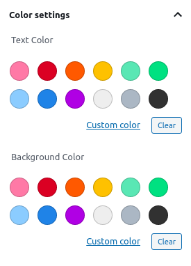
A custom color palette is a collection of pre-defined colors chosen by the theme that they make available for use in blocks for text color and background colors. When you have a block – such as a paragraph block – focused the options for this appear in the sidebar found at Block -> Color settings.
If a theme doesn’t define a custom color paletted then WordPress outputs a default one with a veriety of colors.
It’s worth noting that you can select a custom color with a color picker too if none of the defined ones are to your liking. The color picker allows you to use your mouse or to input it via hex, rgb or hsl values.
When adding a custom palette you need to define the colors and then provide the styles to make them display. You can be as creative or as selective as you want to be with these. If you want to be super selective you can even disable the ability to select a custom color altogether.
The Code to Define a Color Palette for the Block Editor
With just one call to add_theme_support( 'editor-color-palette', $args ) for the editor-color-palette item you can setup as many colors as you desire.
The 2nd paramiter – the $args – passed is an array of arrays containing each of your color options. You can pass this as a variable or you can pass the array directly.
You can have as many colors as you want. Each color needs 3 values.
- A human readable name.
- A slug to identify it with.
- The color you want to use.
Adding the code below to your functions.php file or inside your after_theme_support action is will add the colors to the editor. Remember to replace the text-domain from the examples(blockz) with the text-domain of your own theme.
// Adds support for editor color palette.
add_theme_support(
'editor-color-palette',
[
[
'name' => __( 'Orange', 'blockz' ),
'slug' => 'orange',
'color' => '#dd6b20',
],
[
'name' => __( 'Light orange', 'blockz' ),
'slug' => 'light-orange',
'color' => '#ed8936',
],
[
'name' => __( 'Dark orange', 'blockz' ),
'slug' => 'dark-orange',
'color' => '#c05621',
],
[
'name' => __( 'Dark gray', 'blockz' ),
'slug' => 'dark-gray',
'color' => '#1a202c',
],
]
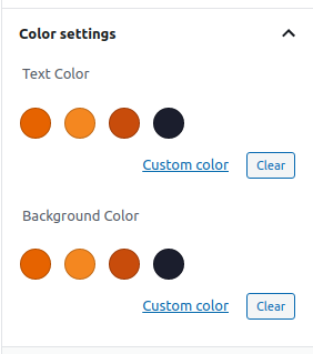
);After adding your editor-color-palette the Color settings will have changed in the theme to show the colors you have chosen.
Styling Your Editor Color Palette For the Frontend and the Backend
The editor doesn’t simply inline your color choice to the markup. Inline styles are generally a bad idea. What does happen is css classes are added to items generated from the custom slug you provided.
It adds the has-text-color and has-background classes when those text or background colors have been added to the block. It adds another class that identifies the colors matching the slugs you defined.
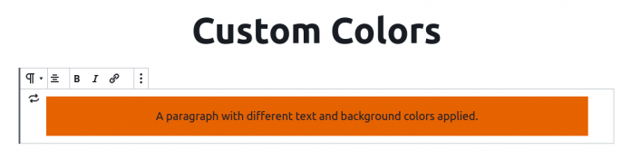
The markup for the paragraph becomes this:
<p class="has-text-color has-background has-text-align-center has-dark-gray-color has-orange-background-color">A paragraph with different text and background colors applied.</p>The classes has-dark-gray-color and has-orange-background-color are the ones that define the colors. You need to define them in your stylesheet for the frontend and for the editor.
I added 4 colors in my Blockz theme.
- Orange –
orange - Light orange –
light-orange - Dark orange –
dark-orange - Dark grey –
dark-grey
The slugs defined for those colors get injected to the appropriate classes in the markup with the format:
has-{{color-slug}}-colorfor the text.has-{{color-slug}}-background-colorfor the background.
For each color you have to define a text and a background set of styles matching the classnames that will generate. These are the styles I have in my theme for the colors above.
.has-orange-color {
  color: #dd6b20;
}

.has-light-orange-color {
  color: #fbd38d;
}

.has-dark-orange-color {
  color: #9c4221;
}

.has-dark-grey-color {
  color: #1a202c;
}

.has-orange-background-color {
  background-color: #dd6b20;
}

.has-light-orange-background-color {
  background-color: #fbd38d;
}

.has-dark-orange-background-color {
  background-color: #9c4221;
}

.has-dark-gray-background-color {
  background-color: #1a202c;
}
Picking Accessible Colors with Sufficient Contrast
People with impared vision such as color blindness (as I have myselef) or those without 20:20 vision can struggle to see certain colors and combinations. This is even more likely to be a problem for them if the colors are not sufficiently contrasted.
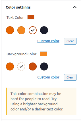
The editor color picker has a system in place for comparing your text and background colors to determine if the contrast between them is sufficient for them to be readable. Without going into too much detail about the calulations it basically tests if contrast is a 4:5:1 ratio which is the WCAG recommendation for AA level.
Other factors come into play when a human considers sufficient contrast levels – such as text size and legibility. Those aspects are not considered by the checker.
When the selected color combinations are deemed not AA level it warns users with a text notice.
“This color combination may be hard for people to read. Try using a brighter background color and/or a darker text color.”
Disabling the Color Picker
If you are being very selective with the colors you want to offer and you don’t want users to have the ability to choose any color other than those you define you can disable the picker with a single line of code.
You do this with another add_theme_support() call – but this time it technically removes support for a part of the color settings on offer.
add_theme_support( 'disable-custom-colors' );With just that one line the option for users to input any color they choose will be gone. In most cases I would not recommend you do this but it is an option that is available to developers.
Summing Up The Process of Adding a Custom Color Palette
This article might make it seem like there is a lot do when adding a custom editor but it is just a 2 (or 3) step process. You need to both define the pallete and add the stylesheet for it. Optionally (and highly suggested) is to include the styles in the editor interface as well otherwise your colors won’t display the same on the frontend as they do when creating the content.
- First you must define your color options via an
add_theme_support( 'editor-color-palette, $args );call. - Second you need to add CSS to your stylesheet that provide the actual looks of the colors available to select.
- As a final step to make sure your custom styles look exactly the same in the editor as they do on the frontend you might want to add some specific styling to elements using the optional editor stylesheet your theme can provide.