Build a Responsive Nav Menu for WordPress
During my attempt to build a responsive theme framework I decided to launch a demo site with it and give it a little style of it’s own. During the building of the site I decided I would need a few pages to describe the project and demo it. I needed some kind of navigation built into the framework to do that… and it had to be responsive. For the initial testing of the site I have only a single media query to define some styles for just large viewports, no other queries are used as it’s coded mobile first.
I also wrote a post about creating a responsive nav using Bootstrap in a WordPress theme. If you’re interested in checking that out then use the button below.
Create a WordPress Menu in your Theme
I created pages to use as the homepage and the blog and added them to a menu – all within the WordPress dashboard. In my theme framework’s functions.php file I added support for a custom ‘header-menu’ and placed it at the bottom of the header.php file using standard syntax giving it an id and a class which we’ll use to control and style it.
<?php wp_nav_menu( array( 'theme_location' => 'header-menu', 'container_id' => 'responsive-nav', 'container_class' => 'nav-links' ) ); ?>
Once you add the code to your functions.php file you’ll see the ‘Menus’ option under ‘Appearance’.
Place the following code in your theme’s functions.php file if it doesn’t already support a custom menu. The code adds 2 menus to your theme but in this tutorial we will only be using header-menu.
function register_my_menus() {

register_nav_menus(

array(

'header-menu' => __( 'Header Menu' ),

'extra-menu' => __( 'Extra Menu' )

)

);

}

add_action( 'init', 'register_my_menus' );
I floated the elements and styled the links to match the site text but when I got down to smaller sizes things just took up too much of the screen and shrinking the text to fit made it almost unreadable. So I wanted a dropdown nav on smaller viewports – a touch friendly mobile nav. I’ve yet to make a final decision on where this breakpoint will be set because I’ve not tested with different amounts of links, screen sizes and browsers etc but I’m not simply going to say ‘when you reach the size of an iphone turn into a mobile dropdown menu’ because then I run the risk of simply designing a mobile version of the site when the best practice is to tweak the layout when visually required.
For now I’ll be using loosely defined test sizes of ‘large’ and ‘tiny’ and choosing the breakpoint for the framework later you should choose a breakpoint that works for you.
Taking a mobile first approach I’ll be starting with a dropdown menu and use a media query to define the larger version. I’ll be using a custom CSS3 styled button to open and close the menu but for now I’ll just use 2 ordinary html buttons for ease. The menu will consist of an un-ordered list of links hidden until the button is pressed which requires a little JavaScript to add and remove styles using the onclick method. I’ve wrapped the nav menu in a nav tag instead of an ordinary div.
Within our WordPress theme’s header.php we have this code to create the menu.
<nav id="site-nav" class="main-navigation" role="navigation">

<?php wp_nav_menu( array( 'theme_location' => 'header-menu', 'container_id' => 'responsive-nav', 'container_class' => 'nav-links' ) ); ?>

<div class="clearfix"></div>

<button id="pull" onclick="showNav()">Navigation</button>

<button id="push" onclick="hideNav()">Navigation away</button>

</nav>
That creates the following markup when used on the Theme-Dev site, your markup will be very similar.
<nav id="site-nav" role="navigation">

<div id="responsive-nav">

<ul id="menu-main">

<li id="menu-item-17"><a title="Theme-Dev" href="http://theme-dev.com/">Home</a></li>

<li id="menu-item-18"><a href="http://theme-dev.com/sample-page/">Sample Page</a></li>

</ul>

</div>

<button id="pull" onclick="showNav()">Navigation</button>

<button id="push" onclick="hideNav()">Navigation away</button>

</nav>
We need to include some JavaScript to handle those onclick events.
function showNav(){

document.getElementById("responsive-nav").className += " nav-show";

}

function hideNav(){

document.getElementById("responsive-nav").className = document.getElementById("responsive-nav").className.replace( /(?:^|s)nav-show(?!S)/g , '' )

}

window.onload = function()

{

document.getElementById("pull").addEventListener( 'click' , showNav );

document.getElementById("push").addEventListener( 'click' , hideNav );

}
That adds the ‘nav-show‘ class (which is also added through a larger viewport media query when scalled). Speaking of classes here’s the basic css to make it work. One thing to note is that the nav-show class is repeatedly added when the button is clicked because I haven’t yet included a way of checking if the class is already added.
Update: I’ve changed up the JavaScript a bit since I wrote this to eliminate the repeated adds to the classes using a single function to add and remove the hidden attribute coupled with bottom up media queries and a slightly improved UI. The new code can be found in the updated version included in the Theme Dev core.
#site-nav ul{

text-align: center;

}

.nav-links{

display:none;

}
The media query to swap it from a drop-down menu to a floated list.
@media all and (min-width:1200px) {

#site-nav li {

display:inline;

float:left;

}

#pull,

#push{

display:none;

}

.nav-links{

display:inline;

font-size:22px;

}

.nav-links li{

width:25%;

text-align:center;

}

}
And this is the class that shows the list when in pull mode.
.nav-show{ display:inline; }
Put it just that css into the stylesheet on Theme-Dev and the menu works exactly as expected. When the screen is large (defined as being more than 1200 pixels then show the list but if the screen is smaller than 1200 then show the buttons for the pull version. It’s pretty simple to get working and once you have it working you can then continue to style it however you please.
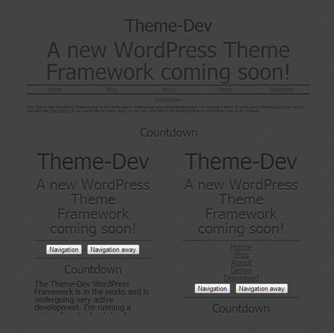
Responsive Nav on Theme Dev
I wrote this post based on findings I made when starting work on my responsive WordPress theme framework: Theme Dev. The code in this post works on it’s own without any additional sytlying but you can make it look any number of ways you want. When I coupled it with the tiny bit of styling I’d done to theme-dev.com it turned out to look pretty decent on it’s own without much additional work. Here’s what the default looks like in pull mode and in full mode.
Thanks for the Menu.But please post a responsive image slider for wordpress.
Sure thing I can come up with a responsive slider using javascript/jquery for you if you want.
But if you need something very quickly then I would suggest this plugin here: http://wordpress.org/extend/plugins/responsive-slider/ It’s simply called Responsive Slider and I’ve used it on a few different projects with no problems. It creates a custom post type “Slides” which you simply add your slides to the same as you would with any other post with featured image and place a shortcode in your page/post/theme file.
Or you could use the bootstrap-carousel.js http://twitter.github.io/bootstrap/javascript.html#carousel as that’s a lovely responsive slider that is easy to work with.
Pingback: Deciding your Media Query Breakpoints - Responsive Web Design
Pingback: Theme-Dev Version 0.3 Feature Set Finalized - PattonWebz
Pingback: Responsive Design By Example | PattonWebz Blog
Hi mate,
Thanks for the great tutorial! I am just wandering if I can get my hands on the new version of this tutorial? I followed the link and it said that the content was lost due to a server failure or something like that.
I am trying desperately to get my website fully mobile responsive but just having a few niggling issues.
Thanks again,
I look forward to your reply!
Hey man,
The new version of this tutorial wound up being a Twitter Bootstrap tutorial and how to make responsive menus with that framework so I guess in actuallity there was never a proper updated/new version of this tutorial 🙁
But I’d love to help you out with whatever kind of responsive issues you have left to solve. Just reply to this comment or drop me an email with your issues and I’ll get back to you ASAP with whatever help I can give you 🙂